Development · 7 min read
The Future of Web Development with Next.js
Next.js is moving the web toward static-first pages with small interactive islands, and this site shows what that buys in practice: every route is prerendered at build time, the home page ships about 101 kB of first-load JavaScript, and font and image fixes cut a first desktop visit from about 1.6 MB to 694 KB.
Static first, interactive where it counts
Static-first means every page is rendered to HTML when the site is built and served as a file, with JavaScript added only where something has to move. On this site the production build marks every route as static, and the home page's first-load JavaScript comes to about 101 kB: the shared React and Next.js runtime plus the few components that animate.
The App Router makes this the default. A page that reads no request data, such as cookies or headers, is prerendered automatically, and pages with parameters, like a journal post, can still be generated ahead of time with generateStaticParams. Nothing about the hero, the timeline or the recordings needs a server at request time, so nothing runs on one.
The payoff is practical. Static HTML is fast to serve and cheap to host, and it is complete before any script runs: search engines and AI crawlers get the full text of every page without executing JavaScript. The Next.js rendering docs explain the model in detail.
Server components by default, client islands by exception
A client island is a component marked with 'use client' that hydrates and runs in the browser. Everything else is a server component: it renders to HTML at build time and sends none of its own code to the visitor. The rule of thumb on this site is simple — if a component only displays content, it stays on the server.
- Client islands: the hero (layout measurement, parallax and two WebGL mist layers), the page timeline (a scroll-linked playhead with J/K/L playback), the pinned project monitor that cuts between recordings, the header, smooth scrolling and the contact form.
- Server components: the logline, the credits, the end card, the footer, the career chart on the about page and the constellation.
The constellation shows what belongs on the server. The seven stars of the Big Dipper are stored as real J2000 coordinates and projected onto the page at build time, so the browser receives a finished SVG and no trigonometry:
const RAD = Math.PI / 180;
const RA0 = 186 * RAD;
const DEC0 = 55.6 * RAD;

function project(ra, dec) {
  const a = ra * RAD;
  const d = dec * RAD;
  const D = Math.sin(DEC0) * Math.sin(d) + Math.cos(DEC0) * Math.cos(d) * Math.cos(a - RA0);
  const x = (Math.cos(d) * Math.sin(a - RA0)) / D;
  const y = (Math.cos(DEC0) * Math.sin(d) - Math.sin(DEC0) * Math.cos(d) * Math.cos(a - RA0)) / D;
  return [-x, -y];
}Self-hosted fonts and their hidden costs
next/font downloads Google Fonts at build time and serves them from the site's own domain, so visitors' browsers never contact Google, and it generates size-adjusted fallback fonts that limit layout shift while the real face loads. It removes a third-party request. It does not decide how many bytes you ship — that part is still yours.
The first cost on this site was the variable version of Anek Bangla, the face used for the Bengali name সপ্তর্ষি. Its Bengali subset, with width and weight axes, weighs 437 KB. The Bengali here is a name, not running text, so a single static weight is enough, and that file is 49 KB:
// One static weight: the Bengali is a name, not running text (49 KB vs 437 KB variable).
const bangla = Anek_Bangla({
  subsets: ['bengali'],
  weight: '500',
  variable: '--font-bangla',
  display: 'swap',
  preload: false,
});The second cost was subtler. unicode-range is a @font-face descriptor that lists the characters a font file covers; the browser downloads that file only if the page uses one of them. Anek Bangla's Latin subset was declared too, and the full name — সপ্তর্ষি চট্টোপাধ্যায় — contains a space. A space is a Latin character, so that one space pulled down a Latin file of about 97 KB the site never needed.
The fix was to put the already-loaded Latin face first in the Bengali font stack. Archivo now supplies every Latin character, including the space, and only the Bengali glyphs fall through to Anek:
:root {
  /* … */
  --f-sans: var(--font-archivo), 'Archivo', system-ui, -apple-system, 'Segoe UI', sans-serif;
  /* Archivo first: Latin characters (even a space) never pull in Anek's Latin file */
  --f-bn: var(--font-archivo), var(--font-bangla), sans-serif;
}

.bn {
  font-family: var(--f-bn);
  font-weight: 500;
  font-stretch: 100%;
}| Font file | Before | After |
|---|---|---|
| Anek Bangla, Bengali subset | 437 KB (variable, two axes) | 49 KB (one static weight) |
| Anek Bangla, Latin subset | about 97 KB (pulled in by a space) | not requested |
| All fonts on a first desktop visit | 661 KB | 176 KB |
Responsive images: let the browser do the maths
srcset lists the image files available and their widths; sizes tells the browser how wide the image will be drawn. With both, the browser picks the smallest file that still covers the screen's device pixels. The MDN reference for the img element covers the syntax. The interesting part is choosing the numbers.
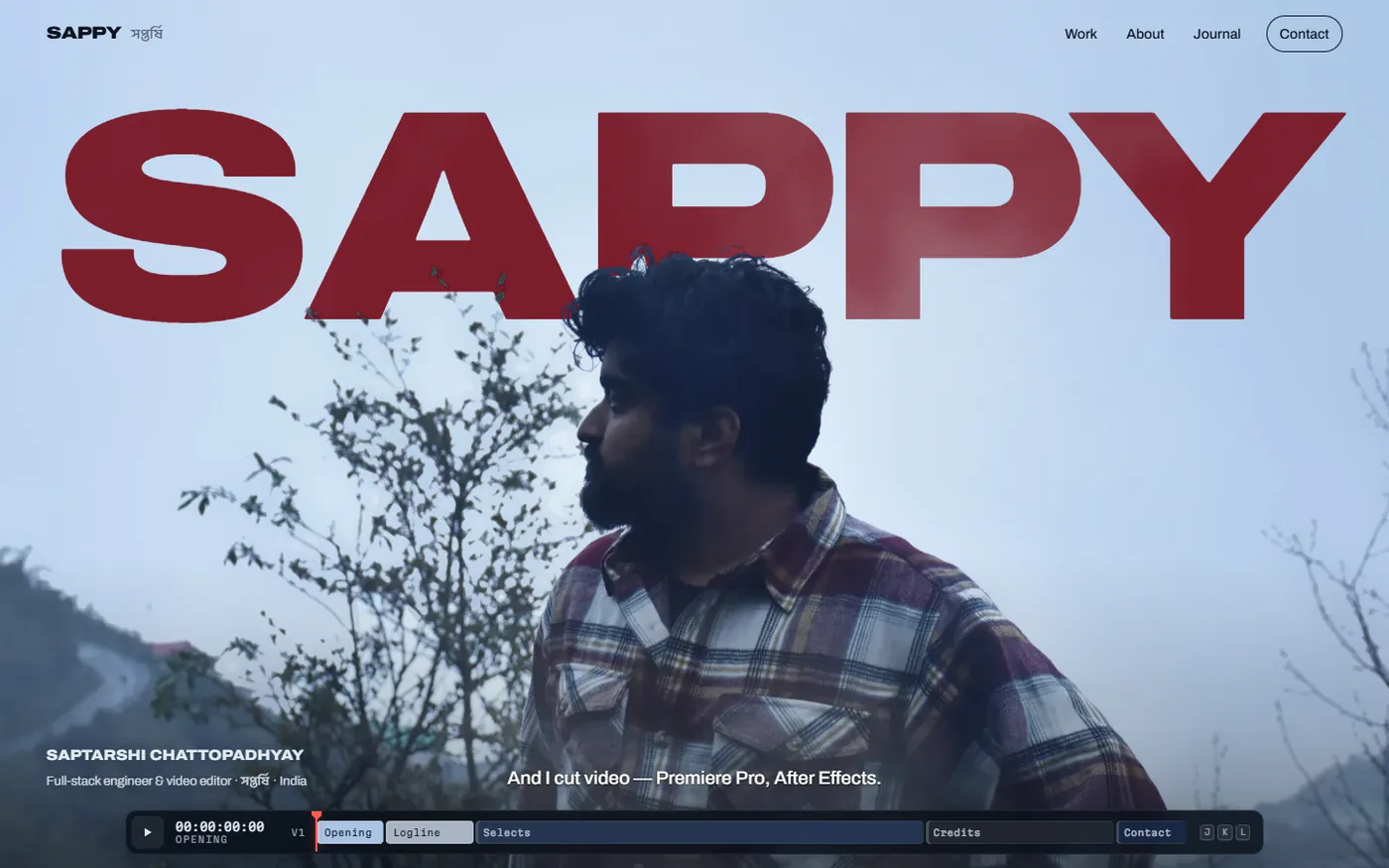
The hero's cut-out ships in four widths — 1000, 1600, 1800 and 2400 pixels — as WebP files with an alpha channel, at 130, 292, 344 and 531 KB. It is the largest image on the first screen, so it is also marked fetchPriority="high" (web.dev on Fetch Priority).
<img
  src="/hero/fg-1600.webp"
  srcSet="/hero/fg-1000.webp 1000w, /hero/fg-1600.webp 1600w, /hero/fg-1800.webp 1800w, /hero/fg-2400.webp 2400w"
  sizes="(orientation: portrait) 150vw, max(100vw, 178vh)"
  alt={`${person.name} on a misty hillside, looking away from the camera`}
  fetchPriority="high"
  decoding="async"
/>On a 1440 × 900 laptop window the photo covers the frame, so max(100vw, 178vh) resolves to 1602 CSS pixels. At 1× density the browser needs at least 1602 image pixels — just more than the 1600w file — so before an 1800w file existed it fetched the 2400w one. Adding the in-between width saves about 187 KB on that common screen size.
Phones are the opposite problem. In portrait, the hero draws the cut-out about 2.64 times wider than a 390 × 844 screen — roughly 1,030 CSS pixels — so the head and shoulders fill the view. Described honestly, a 3× phone would ask for about 3,100 pixels and download the 2400w file. The site declares 150vw for portrait instead: 390 × 1.5 × 3 = 1,755, which selects the 1800w file and still gives about 1.75 image pixels per CSS pixel. The margin is thin on purpose — an earlier 160vw worked out to 1,872, just past 1,800, and the browser quietly fetched the 2400w file instead; a network check, not the arithmetic on paper, caught it. A soft, misty photograph tolerates that trade well; a screenshot of small text would not.
Metadata, file conventions and structured data
The App Router's Metadata API turns titles, descriptions, canonical URLs and social cards into exported objects, and its file conventions turn files into tags. On this site an opengraph-image.jpg in the app root becomes the share image, icon.svg becomes the favicon, and the robots.txt and sitemap.xml routes are produced at build time. The Next.js metadata docs list every convention.
export const metadata = {
  metadataBase: new URL(person.site),
  title: {
    default: 'Sappy — …',
    template: '%s — Sappy',
  },
  description,
  // …
};metadataBase turns relative image and canonical URLs into absolute ones, and the title template lets each page state only its own subject while the brand is appended consistently.
Structured data is the other half. A JSON-LD script describes the person behind the site — name, role, country and the profiles elsewhere that belong to the same person — in the schema.org vocabulary that search engines and AI systems already read. The share image is a real frame, too: a headless browser renders the hero at 1200 × 630 and saves it, so a link preview matches what visitors will see.
What still needs care
Static-first doesn't remove the hard parts; it moves them into the client islands, where layout that depends on fonts, viewport size or effects has to agree with the server's HTML.
Measure after the real font arrives
The hero sizes its title to the viewport in the browser, so it waits for the exact face with document.fonts.load() before measuring and keeps the picture hidden until the layout is applied — measuring the fallback font would size the title for the wrong letterforms. Even then the title overflowed, and the cause was elsewhere: letter-spacing set in em on a parent is inherited as an absolute length, so measuring the word at 100 px used the parent's much larger negative spacing. Moving the spacing onto the measured element fixed it.
Expect effects to run twice
In development, React Strict Mode mounts, unmounts and remounts effects to surface cleanup bugs. The WebGL mist's cleanup used to force-lose its context, and because a canvas hands back the same context on the next getContext() call, the remount received a dead one and every shader reported a compile failure. The fix was to release only what the effect created:
return {
  render({ time, mouseX, mouseY, mouseAmt, dissolve }) {
    gl.uniform1f(u.uTime, time);
    // …
    gl.drawArrays(gl.TRIANGLES, 0, 3);
  },
  resize,
  // Don't force-lose the context here: a canvas keeps handing back the same
  // context, and a remount (React StrictMode, fast refresh) would get a dead one.
  destroy() {
    gl.deleteBuffer(buf);
    gl.deleteProgram(program);
  },
};Upgrade below the fold
The project section renders as a plain list on the server, which works everywhere, and upgrades to a pinned monitor on wide screens after hydration. Because the switch happens below the first screen, visitors arriving at the top never see the layout change.
Where this is heading
The direction is already visible in the App Router's defaults: render on the server, send less JavaScript, and treat fonts and images as part of the performance budget rather than assets you drop in. On this site the fixes above took a first desktop visit from about 1.6 MB to 694 KB, with the largest content painting in about 0.8 seconds on a local production build without network throttling.
| First desktop visit | Before | After |
|---|---|---|
| Total transfer | about 1.6 MB | 694 KB |
| Fonts | 661 KB | 176 KB |
| Images | 773 KB | 360 KB |
None of it is exotic: static routes, server components, small islands and the habit of checking what each file costs. For a site built this way, see website development; for the craft behind this one, read how the hero's title was keyed behind a portrait, how the page timeline works and how its video was prepared for the web.