Design · 7 min read
Design Systems: Why You Need One
A design system is a small set of named decisions — colours, type, spacing and structure — written down once and reused everywhere. Even a one-person site gains from one: consistent pages, faster decisions and fixes that land everywhere at once. This site's palette comes from a single photograph, and one type family covers every role.
What a design system is at personal-site scale
A design system is the set of decisions a site is built from — its colours, type, spacing and structural devices — named once and reused everywhere. At company scale that means component libraries and documentation. For a personal site it can be one block of CSS custom properties, a handful of type roles and a few rules about what each element is allowed to mean.
A design token is one of those named decisions: a colour, a font, a size or an easing curve stored under a name such as --ink and referenced everywhere instead of being retyped. On this site the core palette lives in a single :root block in the stylesheet, and components read from it.
Even with one designer and one developer — often the same person — a system pays off in three ways:
- Consistency across pages. The home page, the work archive, the about page and the journal share one palette and one set of type roles, so they read as one site.
- Faster decisions. A new page starts from existing roles instead of fresh choices about colour and size.
- Fewer one-off fixes. When something is wrong, the fix goes into a token or a role and lands everywhere at once.
Sample the palette from something real
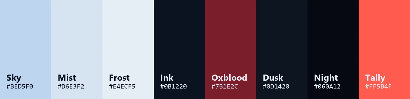
The most reliable source for a palette is a real image that belongs to the subject. This site has one photograph — a portrait on a misty hillside — and its colours were sampled from it, so the page and the picture share the same light.
| Token | Hex | Role | Where it comes from |
|---|---|---|---|
| Mist | #D6E3F2 | Ground for the day sections; the colour of the hero's mist | The haze over the hills, a little lighter than the sampled sky (#BED5F0) |
| Ink | #0B1220 | Text on mist | The darkest values in the frame: hair and shadow |
| Oxblood | #7B1E2C | The hero title and accents on light grounds | The red the eye reads in the plaid shirt |
| Dusk, Night, Black | #0D1420, #060A12, #040507 | Grounds for the work, the credits and the contact card | Day turning to night down the page |
| Frost | #E4ECF5 | Text on dark grounds | A cool white in the mist's blue family |
| Tally | #FF5B4F | The playhead, live and 'now' indicators, and form errors | The red tally light on a camera |
One measurement changed the choice of accent. To the eye, the shirt in the photograph is maroon. Sampled pixels say otherwise: blue-purple values such as #423D5B and #48455E, because the whole frame carries a strong blue cast — the raw sky sampled around #B6D4F9. People discount a colour cast automatically, an effect called colour constancy; a colour picker does not. So the oxblood was chosen for what people perceive, and it became the one warm note in a cool frame.
A palette also has to work as text. Measured with the WCAG contrast formula, every text pairing clears the 4.5:1 minimum for normal text by a wide margin (web.dev on colour and contrast):
| Text on ground | Contrast ratio |
|---|---|
| Ink on mist | 14.4 : 1 |
Secondary ink (#3A4A62) on mist | 6.9 : 1 |
| Oxblood on mist | 7.8 : 1 |
| Frost on dusk | 15.5 : 1 |
Secondary frost (#95A3B8) on dusk | 7.2 : 1 |
One type family, three widths
This site uses one variable family, Archivo, across its width axis: 125 percent for titles, 100 percent for reading and 75 percent for labels, the way footage runs across aspect ratios.
| Role | Setting | Used for |
|---|---|---|
| Display | Archivo 900, width 125%, uppercase, −0.035em tracking | Page titles, section titles, project names |
| Reading | Archivo at width 100%, 17 px base size | Body text, summaries, forms |
| Label | Archivo 650, width 75%, uppercase, +0.18em tracking | Eyebrows, credit roles, field labels |
| Timecode | Martian Mono at width 87.5%, tabular figures | The timeline, the monitor bar, dates |
| Bengali | Anek Bangla 500 | The name সপ্তর্ষি |
Width does the job a second display family usually does. Expanded capitals feel like a film title, condensed capitals read as captions, and the normal width stays comfortable for paragraphs. Because it is one variable font, the three roles share letterforms and a single file: Archivo's Latin subset, with both its width and weight axes, is about 88 KB.
.label {
  font-stretch: 75%;
  font-weight: 650;
  font-size: 0.74rem;
  letter-spacing: 0.18em;
  text-transform: uppercase;
  opacity: 0.72;
}
.display {
  font-weight: 900;
  font-stretch: 125%;
  text-transform: uppercase;
  letter-spacing: -0.035em;
  line-height: 0.86;
}Structure that encodes real information
Structural devices — rules, labels, numbering, layouts — should say something true about the content rather than decorate it. Three devices on this site carry real information.
A timeline that doubles as a colour script
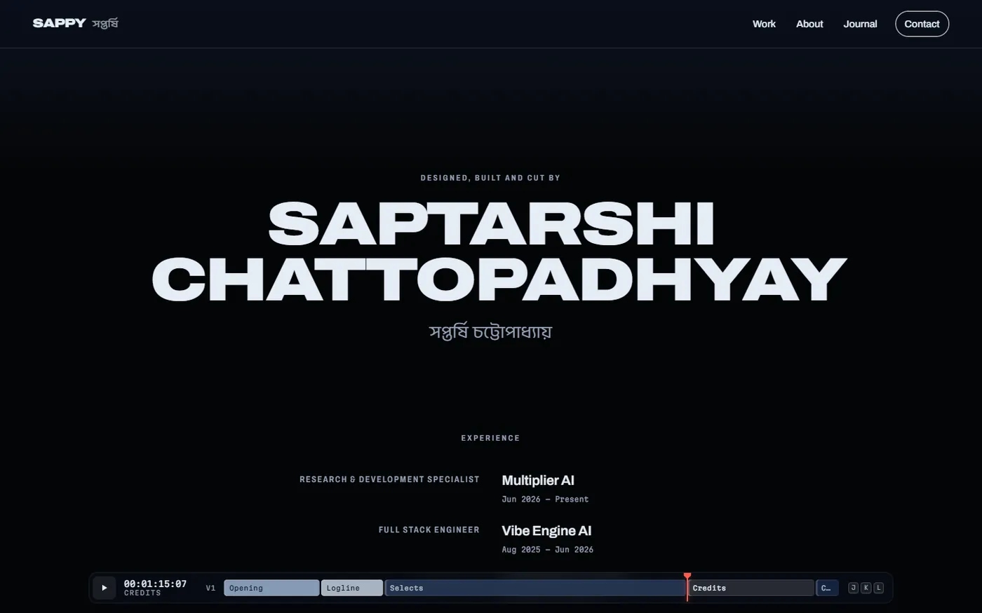
Every section marked as a clip becomes a block on the page timeline, sized by its share of the scroll and tinted with that section's background. Read left to right, the strip is the site's colour script — the film term for a row of colour keys that shows how a palette changes from scene to scene. Labels stay legible on every tint because their ink is picked by luminance:
// Clips are tinted with their section's grade, so the strip doubles as the
// page's colour script; pick legible label ink for each.
function inkFor(hex) {
  const n = parseInt((hex || '#2b3e5e').replace('#', ''), 16);
  const lum = (0.2126 * ((n >> 16) & 255) + 0.7152 * ((n >> 8) & 255) + 0.0722 * (n & 255)) / 255;
  return lum > 0.55 ? '#0B1220' : '#E4ECF5';
}
// …
const color = el.dataset.clipColor || '#2B3E5E';
Experience set as end credits
The experience section is laid out like film end credits: each role is right-aligned to the left of a centre gutter and each name is left-aligned to its right. That layout exists to pair a job with a name at a glance, which is exactly what a list of roles and employers needs.
A sky drawn from real coordinates
Saptarshi — the seven sages — is the Indian name for the Big Dipper, and it is also Sappy's given name. The end card draws those stars from their J2000 coordinates, projected when the site is built, and labels Mizar and its faint companion Alcor together as Vashistha and Arundhati. Because the positions are real, the device carries meaning instead of decoration.
Structure can mislead, too: projects carry no 01/02 numbering, because they are not a sequence.
Keep tokens in code, not in a document
For a site maintained by one person, the most reliable home for a design system is the stylesheet itself: tokens as CSS custom properties, roles as a few classes, and components that only reference them. A separate document drifts out of date; the code cannot.
:root {
  --mist: #D6E3F2;
  --mist-deep: #BFD2E8;
  --sky: #BED5F0;
  --ink: #0B1220;
  --ink-soft: #3A4A62;
  --ox: #7B1E2C;
  --dusk: #0D1420;
  --night: #060A12;
  --black: #040507;
  --frost: #E4ECF5;
  --frost-soft: #95A3B8;
  --tally: #FF5B4F;
  /* … */
  --f-sans: var(--font-archivo), 'Archivo', system-ui, -apple-system, 'Segoe UI', sans-serif;
  --f-mono: var(--font-mono), ui-monospace, 'SFMono-Regular', Menlo, Consolas, monospace;
  /* Archivo first: Latin characters (even a space) never pull in Anek's Latin file */
  --f-bn: var(--font-archivo), var(--font-bangla), sans-serif;
}Two fixes on this site show why this matters. The Bengali font stack is a single token, --f-bn; reordering it once fixed every Bengali span on every page and stopped an unneeded download of about 97 KB, as described in The Future of Web Development with Next.js. And when long words such as CHATTOPADHYAY overflowed small phones, the fix went into the minimum sizes of the display roles, so every page using those roles was fixed at once.
Tokens can cross into JavaScript when they must: the hero's WebGL mist uses the --mist colour, so the scroll dissolve ends exactly on the next section's background.
What the system leaves out
A design system is also a list of things you agree not to do, which keeps a site from collecting effects one page at a time:
- No decorative gradients. Gradients only do jobs: the day-to-night transitions between sections, the scrim that keeps the hero's captions legible and the hatching that marks future dates on the career chart.
- One alarm colour, used sparingly. The tally red marks the playhead, things that are live or playing, and form errors.
- No numbering without order. Index numbers appear only where sequence carries information.
- No custom cursor, marquee or loading counter. Each would add motion without adding meaning.
- Motion with a reason. The grade-in, the focus pull, the scroll dissolve and the cuts each borrow a real editing gesture. Under reduced motion the hero renders as a still, transitions drop to near zero and recordings wait for a click.
How to start one
A useful system for a personal site fits on one screen. Here is a practical order of work:
- Pick a source — a photograph, a product, a material — and sample five or six colours from it.
- Check every text pairing against the WCAG contrast minimum before using it.
- Choose one type family with a width or weight axis and give it three roles: display, reading and label.
- Write the tokens into
:rootand the roles into a few classes, and let components reference only those. - Add a structural device only when it encodes something true.
- Write down what the system will not do.
The rest of this site's making-of covers the pieces in detail: keying the hero title behind a portrait, building the page timeline and video for the web. For a site built on a system like this one, see website development.